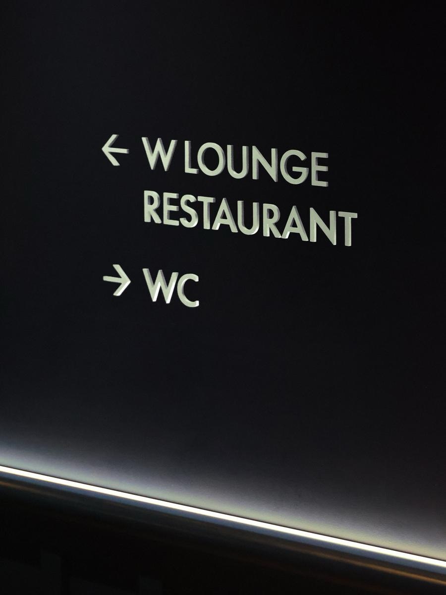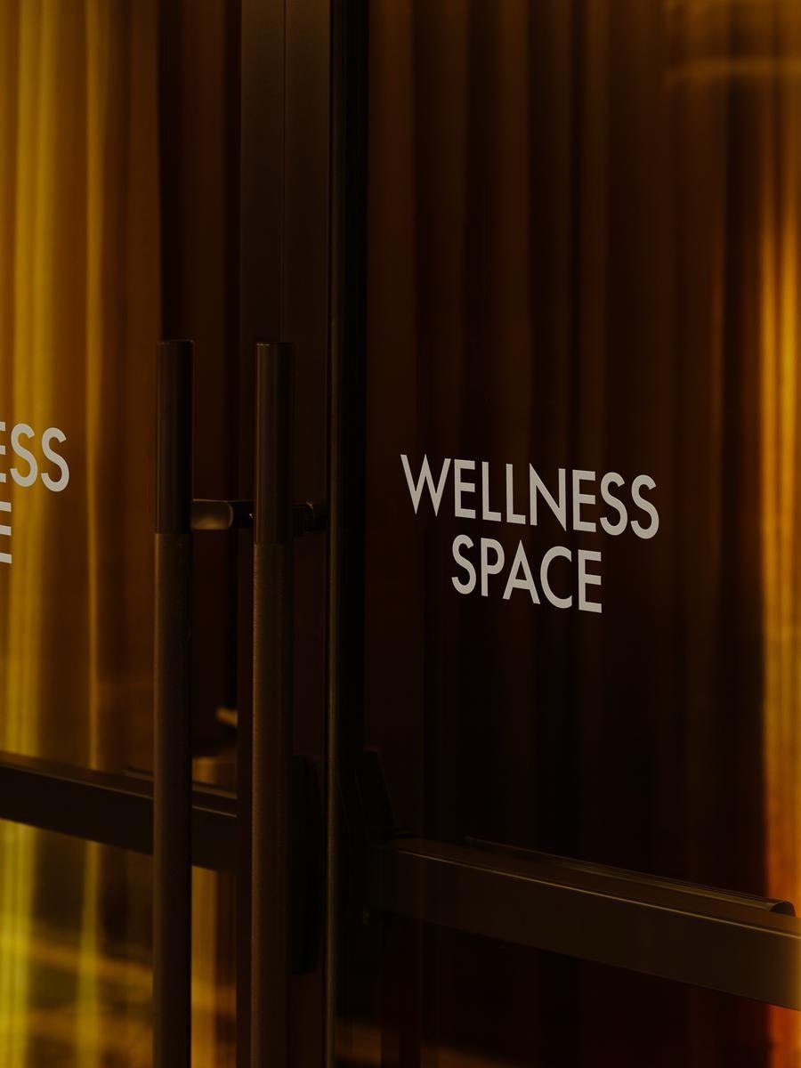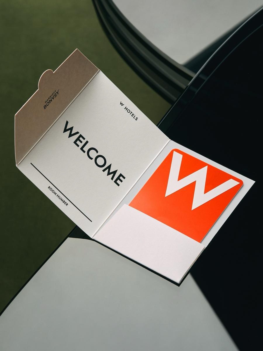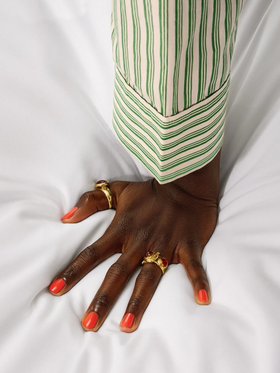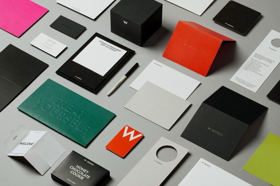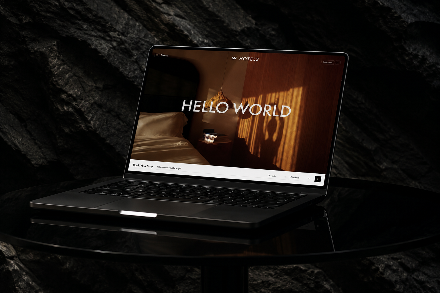
A global identity system for W Hotels, created with Porto Rocha to move the brand beyond the generic signifiers of luxury hospitality. Bold, considered, and unmistakably W — carried consistently across 68 hotels worldwide, from photography and signage to print and the digital booking experience.
Visit W Hotels
W Hotels had drifted toward the generic signifiers of luxury shared by every upscale hospitality brand. The system needed to work at real scale — consistent across 68 properties worldwide and every touchpoint a guest encounters, from a sign in the lobby to the booking flow online — without losing the confidence that made W feel different in the first place.
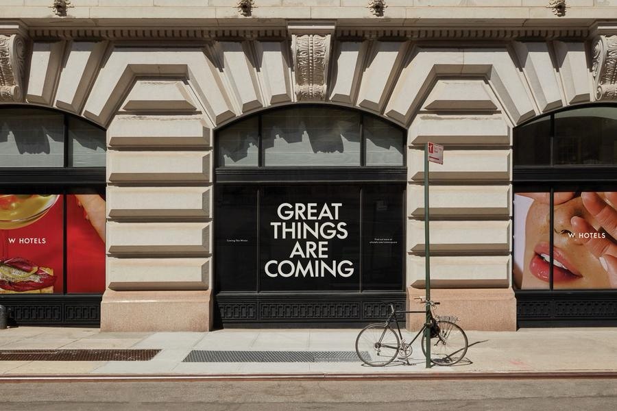
Working within Porto Rocha's design team, I contributed to the visual system across photography direction, print collateral, and digital touchpoints — welcome cards, in-room wayfinding, branded stationery, storefront takeovers, and the hotel booking experience. The direction favors bold typography and considered, editorial photography over typical hospitality stock imagery, applied with enough restraint that the brand reads as one system everywhere a guest meets it — not a lobby identity and a separate website identity.