1. Glassmorphism 2.0
Glassmorphism first swept the design world a few years ago with its frosted-glass panels and blurred backgrounds — and it hasn't gone anywhere. In 2024 it has matured into something more restrained and functional. Designers are now pairing subtle backdrop-filter blur with micro-borders set at very low opacity, letting the background content bleed through without overwhelming the UI. The key shift is intentionality: glass is used where it reinforces depth hierarchy, not just as visual decoration. When done right, it adds a sense of layering and material richness that flat design simply cannot match.
2. Bento Grid Layouts
Apple popularised the bento-style grid in their product keynotes and the design community took notice. The idea is to arrange distinct content blocks — of varying sizes — into a tight, cohesive mosaic that still feels airy. Each cell is self-contained yet part of a visual system, making bento grids ideal for showcasing multiple features or portfolio pieces at once. In 2024 this layout has moved from product marketing pages into editorial design, pricing sections, and even blog archives. CSS Grid makes implementation straightforward, and the asymmetric rhythm keeps the eye moving in an engaging, non-linear way.
3. Expressive Typography
Headlines are no longer just text — they are design elements in their own right. Oversized type set at 10–20vw fills viewport-width containers and creates instant visual impact without a single image. Designers are mixing serif and sans-serif weights in the same heading, using variable fonts to animate letterforms on scroll, and offsetting baselines to create a sense of kinetic energy. The combination of Satoshi for geometric structure and Gambetta for elegant italics is a perfect example of this pairing philosophy: contrast that creates personality while maintaining readability at every size.
4. Micro-interactions
Small, purposeful animations have always separated polished products from average ones. In 2024, micro-interactions have become even more nuanced — cursor trails that subtly influence nearby elements, button states that ripple with haptic-inspired feedback, and navigation links that reveal their destinations through smooth colour transitions. The golden rule remains unchanged: micro-interactions should reinforce meaning, not distract from it. A hover state that lifts a card by 2px communicates interactivity far more elegantly than an elaborate keyframe animation that delays the user's next click.
5. Dark Mode First
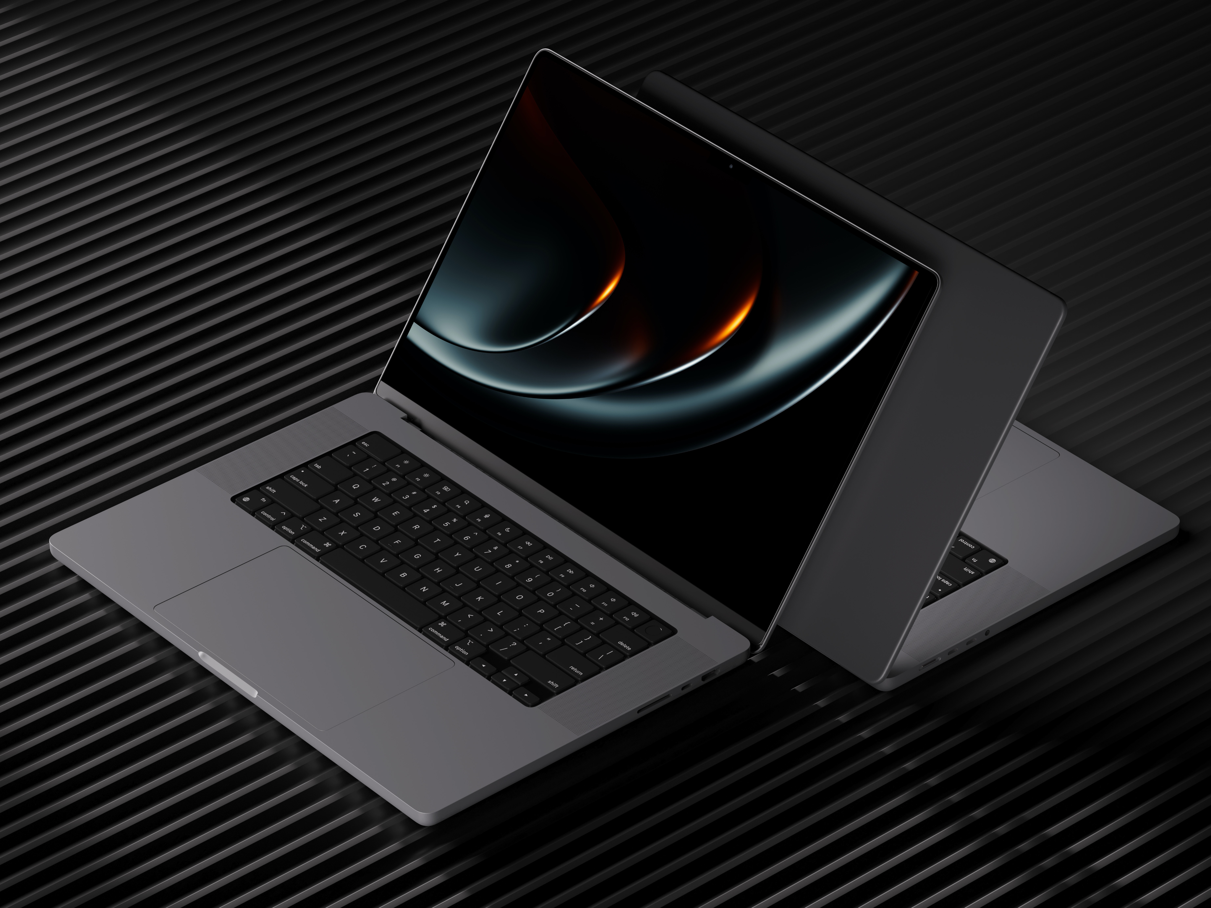
Dark-first design is no longer an afterthought — it is increasingly the primary design context. High-end portfolios, SaaS dashboards, and luxury brand sites are launching dark by default, reserving light mode as the accessible alternative. Working dark-first forces a designer to think in terms of luminance and contrast from the ground up, which often produces more cohesive colour systems overall. It also aligns with the growing preference among users who spend long hours in front of screens. When your base palette is a near-black like #0e0e0e paired with a warm accent like #dac5a7, you get depth and elegance that light interfaces struggle to replicate.
"Design is not just what it looks like. Design is how it works."